Data visualization
This is a design challenge I took as consideration for a position as Lead Interaction Designer at a company called Lattice Engines. Most design challenges lack the real-world opportunity to understand the requirements and deliver the desired outcome through an iterative process and this was no exception.
Typically, I would either have a creative brief provided with a followup meeting to answer any questions, or host a workshop with stakeholder to nail down the requirements. However, given that Design Challenges are growing in popularity as a prerequisite for design positions in Tech, I caved in and went for it.
Prior to excepting the challenge I emailed a series of questions that I would normally ask in stakeholder interviews and below is the response:
"Demonstrate how far you can get, from whiteboard to visual design, in a short period of time. The content you create for yourself will factor into the success-fail criteria. There is no right or wrong design, how you go about it in a short period of time while capturing the solution. Instead of a box with text, round the edges and get some style in there. There are no real expectations, and the team would like to see what a final screen looks like. Take as many shortcuts as you can."
The suggested time to execute on the challenge was:
"No more than 6 hours".
White board session
Before presenting the challenge to me, there were two interview sessions. In the first session, I presented my work with the rationale supporting my process, which was well-received. The second was a white-boarding session where I was given a scenario and asked to work through the scenario as additional information was presented.
The whiteboard session was intended to quickly distill several use-cases and sketch out the UI for a single page layout. The information was verbally communicated in a one-on-one session within a small conference room that over-looked the beautiful San Mateo Bridge in California. This is a generalized summary of the use-case scenario:
"Design a dashboard for the user to manage the company's portfolio. The company comprises 100 coffee plantations and 200 products, with multiple varieties made up of 20 unique variables. The company also conducts trials for new product development. User is the VP of Global Operations who need to; 1) Manage operations based on; what's growing and where, cost of workers, yield, sales/cost, labor, maintenance, etc. and 2) Generate financial reports."
Luckily, I took screenshots of the white-board since they became all I had to go from for executing on the Design Challenge.
Research
No additional information was provided to me. No content. No feature sets. No mandatory actionable items. No established flow. No data for basing the data visualization's on, pie-in-the-sky open-ended, subject-to-interpretation, a blank slate. OK...here we go!!!
Leveraging the world-wide-web as a replacement for User Interviews, I began researching coffee companies. As I learned about what a coffee companies portfolio comprises, I recorded the various information I felt provided the most relevance to the use-case scenario presented in the white-boarding session. That information was recorded in a simple text editor to be later structured and serve as content in the final page layout.
Information architecture
As a point of reference for basing my decisions, I established a general flow. It was pretty basic but went something like this:
successful sign in > overview of properties & products > identify low performing properties > select the lowest performing property > review financials > designate 1st quarter time range based on month and year > email: visual representation, supporting data, and suggested course of action to corporate team
I know. Too basic, very high-level, but it was enough to keep me focused on the task-at-hand. I then combined the whiteboard information with the content I collected from my online research and bucketed the content based on high-level information groupings.
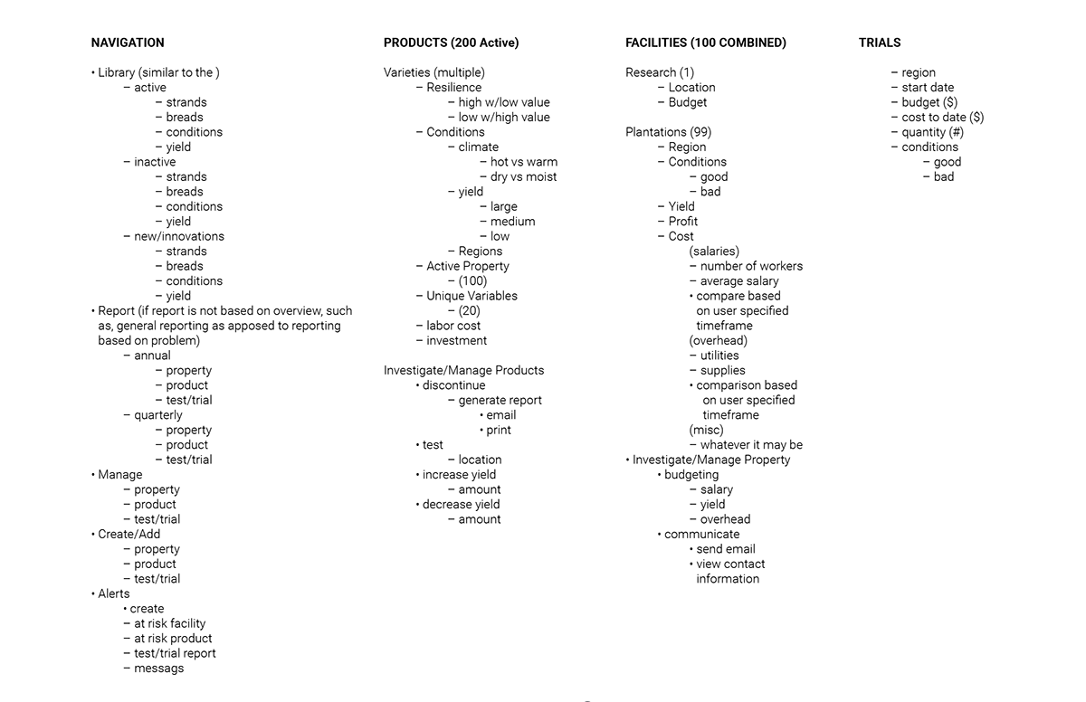
In the document above, I am using dashes to record static content, indents to show the level various content is accessed, and bullets to record actionable items. This is how I quickly record high-level information and update on the fly. The information is distilled down to the simplest structure by reducing redundancies within each grouping and sorted based on the use-case scenario and tasks associated. This works for existing products, as well as product innovations, and it works like a charm.
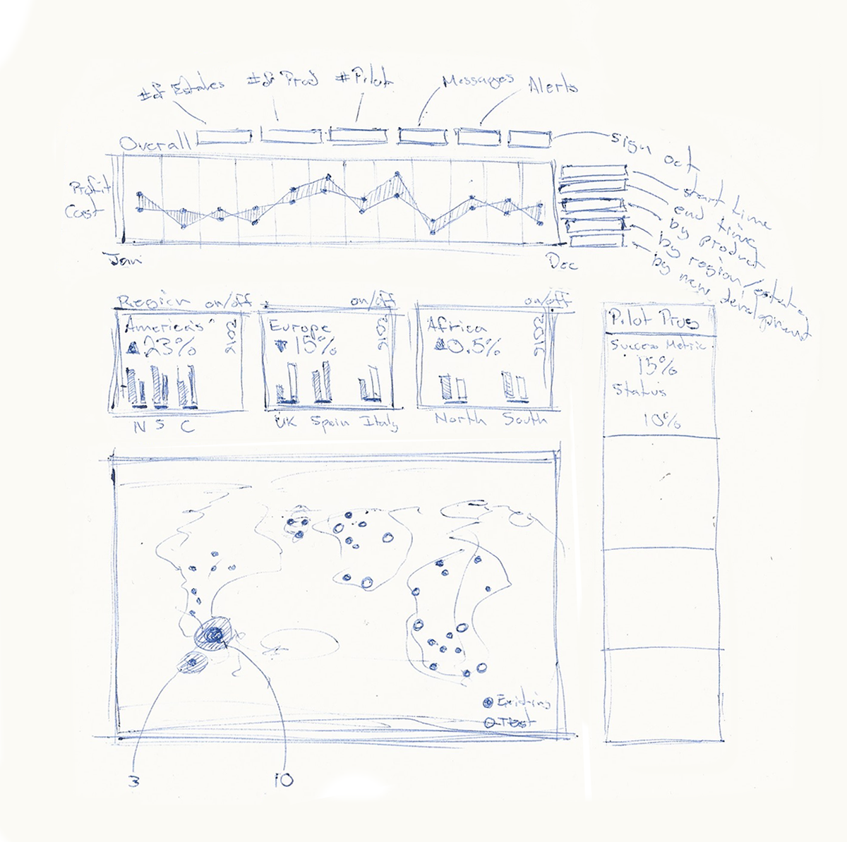
Preliminary sketches
Once capturing the content and structure, I began sketching out ideas. Given that the user's primary objectives are to Manage and Report, I placed financial information as the utmost importance. I used time as the KPI for each supporting sub-category. This way, all data visually represented in the dashboard could be filtered in the context of Time.
Wireframes
From scratch, I began blocking in the page content. Starting with a black and white pallet while focusing on the high-level bits then working through the visual hierarchy in grayscale. Starting with a black and white color pallet allows me to focus on the layout without being distracted by color balance, harmony, etc., and focus on the visual hierarchy by allocating varying levels of contrast and weight to primary, secondary, and tertiary elements.
Mockups
At this point, I am looking at a page with no representational content. Meaning, there are no metrics, just placement text and copy that indicate purpose. It also lacks color to reinforce the relationships of each element on the page, in addition to established typography styles.
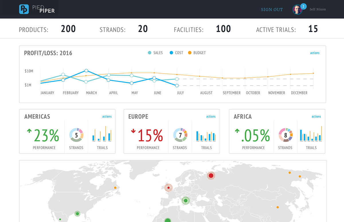
The metrics I chose are intended to communicate a perceived scenario and reinforce the flow. As the metrics changed, so did the page elements to support the story. The idea was to filter the page content based on Time, with actions about each grouping (Product, Trials, Facilities) to filter the page content further. I used Sales v.s. Cost since I thought profit margins would drive management decisions based on Performance. I grouped Facilities by Region, which were further broken down into sub-regions, and Trials were base on Level of Completion.
As content was updated, so was everything else. Icons are crucial in making the connection of elements with their purpose, so I used Font Awesome for the sake of time. Typically, I would generate a color pallet based on user research, brand identity, or an established style-guide, but since I had nothing to go off of, I used a pallet from a project I had worked on in the past.
The final page design was a dynamic dashboard that the user could filter before drilling to execute on either of the primary tasks. The screenshot below is what was delivered.
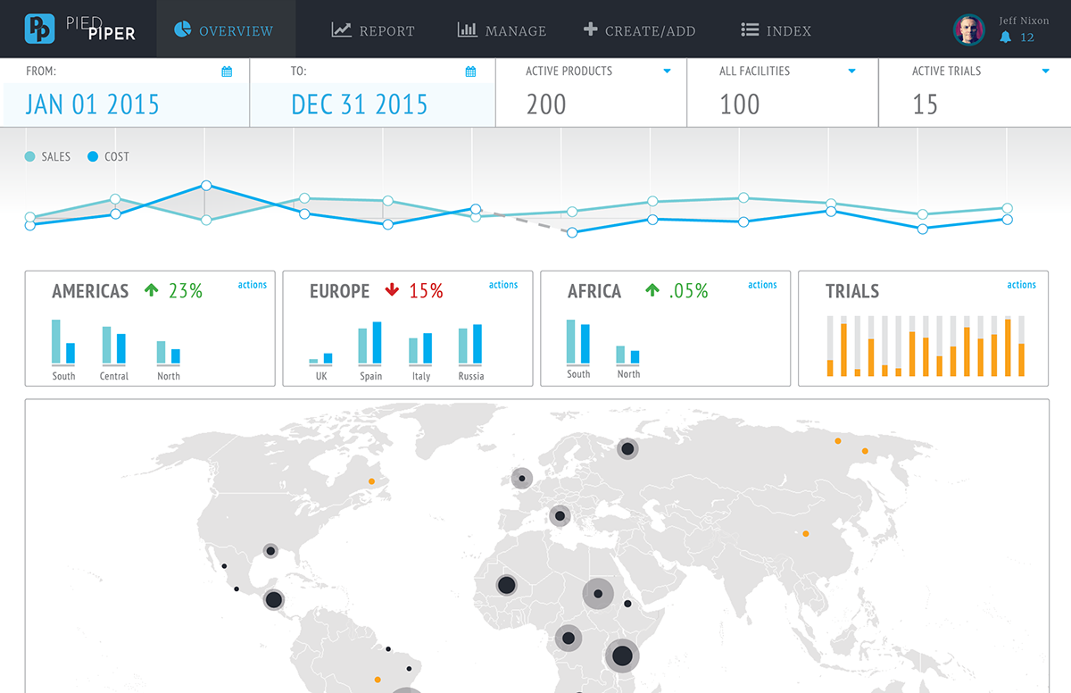
The result is what I would consider being more of a or mockup. Since this was an interaction role, I focused on establishing a flow and structuring content, rather than the visual treatment. However, based on prior discussions with the hiring manager and the DC description of "Instead of the box with text, round the edges and get some style in there," I felt that visual design would inevitably factor into the final critique.
Since the design is at a point where content and structure are established, I wanted to challenge myself. I wanted to see how much more value can be added in another six hours...so I gave it a push.
High fidelity
After fleshing out the original design, I felt the initial layout was too busy. I thought that there were several problems and things I didn't have the capacity to address. The metrics I used for Trials were a huge issue for me. The Map was incomplete, and the Navigation didn't seem necessary. I also found that Time as the only contextual marker for the page content was limiting.
Originally, I intended the Navigation to allow the user to perform a task without drilling in from the dashboard. After giving it more thought, I imagined that the same filtering would occur on those pages as what was available on the dashboard. My gut instinct was that this made for a convoluted experience and detracted from the dashboard's unique value.
I thought working well was the performance metric within the Region tiles adding another level of insight to the user based on location. I ended up moving Product and Trials to the Region tiles and exposing the unique variables as Strands. I felt this provided an added level of visibility to the Financial Overview's breakdown analysis and expanded on the context for the page content. The page reads from top to bottom, providing high-level information as a point of reference for the proceeding content.