Topology
Topology provides a high-level overview of some data schema, like an inventory of assets, at 60,000 feet (high level). It shows the relationship of data sets, objects, and end-points, similar to an ERD (Entity Relationship Diagram). It is an oversimplification of very complex relationships. Typically, there would be just the right level of information provided to inform the user's decision before drilling into whatever task they may be looking to carry out. For ACI, this is the entry point of a Network Admin to a data warehouse responsible for monitoring. To put it into perspective, that's a massive amount of information to oversimplify within a limited piece of real estate.
Problem
The current layout and real-estate are not scalable. A standard schema consists of over two controllers, 15 blades, 23 spines, and over 1,000 end-points. There needs to be a uniform configuration for the graphics representing each node to scale to accommodate the common use-case while providing rich contextual information to inform the users' decisions.
Below is an image of what the APIC topology GUI used to look like, but oversimplified. Imagine thousands of end-points (e.g., Leafs and Spines). Then imagine trying to find what each end-point maps to.
Visual treatment
Each node's graphic representation and end-point visually represent each physical and virtual device and some abstraction of concepts such as routes or the relationship mapping between them.
Scalability
While the graphical treatment may provide some level of context, at scale, the graphics become challenging to understand and lose all definition when zoomed out. The layout may seem to have some level of organization but provides little to no context through purpose.

While the graphical treatment may seem to provide some level of context, at scale the graphics become difficult to understand and loose all definition when zoomed out. The layout may seem to have some level of organization but provides little to no context through purpose.
Solution
A systematized approach provides the rationale for plotting, using color and graphical treatments that scale to accommodate user needs. A simplified visual treatment improves scanability with built-in logic for labeling existing and future nodes and services. The visual cues are clear and concise to inform the users' discovery better and the decision-making process.
Visual treatment
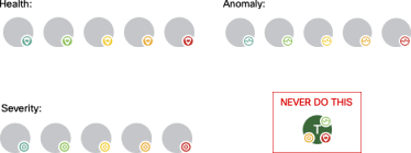
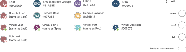
After doing a little digging, I identified 61 types of avatars and three prefixes (subcategories). I systematized color plotting to avoid conflict between the avatar and rationalize a color's allocation to distinguish each avatar. I used the lightest and darkest shades in each set of the Accents color palettes to create the most contrast between each avatar with the colors we had available.
What I am calling a Prefix is referencing the prepended category of an avatar type. For example, there are four categories for a Leaf; Sub Leaf, Virtual Leaf, and Remote Leaf. The graphical treatment addresses scalability and differentiation at various zoom levels while the color remains the same. The difference/affordance is the texture that represents each prefix. The user can distinguish based on the distribution of negative space along each avatar's outer edge.
Scalability
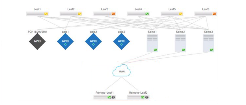
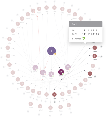
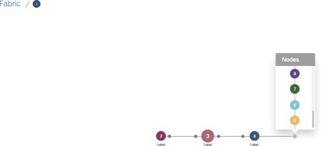
Nodes that are not present within the topology graph's view but exist along a path appear in a panel upon hover of the indicators along the outside edge. The select node is then in focus at the center of the configuration with Breadcrumbs to navigate back. Selecting the indicators reduces the topology to nodes that exist along that path and brings the next set of nodes out of sight before selecting the indicator.
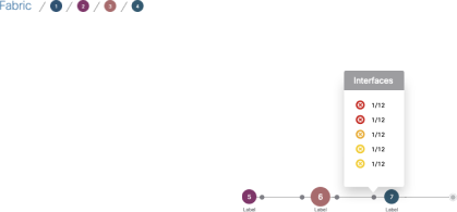
Lines are presented between avatars throughout the topology to show the relationships of nodes. These lines represent a connection, either physical or virtual, between nodes.
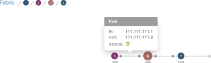
Along the lines at each end are small filled circles that represent interfaces.
On-hover: A list of all ports with their state, status, health, and severity is presented.
On-click:A panel slides out from the right edge of the viewport with a detailed summary of all information about that interface.
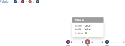
Visual cues
Indicators are graphical representations of the object/node state and health. There is only one indicator for each avatar and will never display more than one. If an avatar requires more than one indicator, the indicator with the highest level of importance takes priority over the other (e.g., Health over State). The lower priority indicators are presented within the hover state pop-over.