Aristotle
Data-driven design system
The Aristotle project documents a design system created in 2017. The 3-part series explains the major steps taken towards completing the project and the rationale associated with each step.
Part 1
Distributed Design Strategy discusses the scope and how it was defined through Experience Workshops.
Part 2 (you are here)
End-to-End Brand Experience focused on bringing the Product Design Strategy together with a post-merger/acquisition rebranding, for an end-to-end brand experience.
Part 3
Living Documentation discussed through examples, the process of defining patterns, creation of the sticker sheet, Adobe Creative Cloud design assets, the Craft Library, and publishing the specifications to a WordPress site as a guide for both designers and developers.
End-to-end brand experience
No more than a month after delivering the initial style guide for development, an acquisition/merger was announced. Brands for both companies dissolved and announced a rebranding decision. The product I supported remained a focus for the organization, but the portfolio of products and services changed, as did the stakeholders due to the merger.
Before the merger, we had discussed brand and to what level of brand impacts the Design Strategy. We had concluded that the brand was not a driver, that the design should primarily focus on a distinct look-and-feel for competitive differentiation, and that the design is iterative based on user research. This decision would allow us to make incremental design changes based on usage and the needs of the user-base.
Post-merger, the strategy changed. The new direction was to build brand equity for the new company and rebrand all products to support that goal.
Brand recognition
During establishing the new design strategy, we determined that Brand-is-Product and Product-is-Brand, meaning that there was to be no delineation between brand and product. They are the same, and the corporate brand now drives product design. It is my opinion that if the company's strategy leans heavily on brand recognition, the product should support that direction. But what does that mean for the entire portfolio? To what degree should brand impact the user's experience, and how does each product tie-in for a cohesive brand experience? Therefore, does each product need to look the same? Or, can each product have distinct sub-branding that ties into the brand but allows for product recognition? If the brand styles negatively connotate the user, how much are we willing to sacrifice usability for brand recognition?
Brand strategy
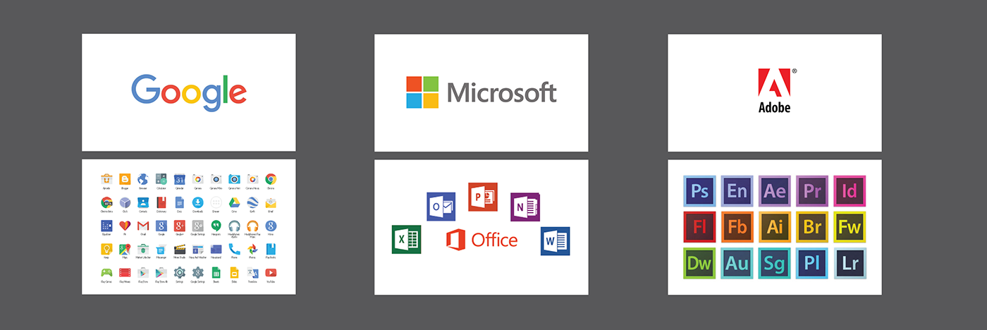
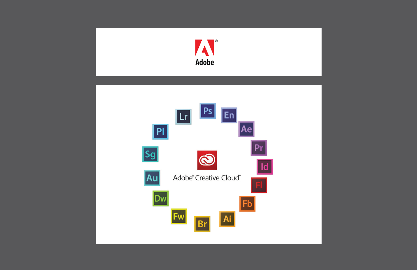
I have been working with Adobe products for over 30 years, watching the emergence of new products, features, and capabilities, but I was amazed when I discovered they based their brand design system on the color wheel. When laid out horizontally, I noticed some patterns that resembled a color spectrum, but I found that each product has a place within the color wheel when laid out in a circular format. Brilliant! Adobe's brand experience strategy ties into the color wheel for a systematic approach that allows scalability when and if their portfolio expands.
Brand analysis
The Adobe brand strategy was perfect for what I was trying to communicate with the newly found team. If the brand impacts the product directly, what is our brand strategy for the entire portfolio? Does each product look the same, or should they each have a distinct look-and-feel for product recognition?
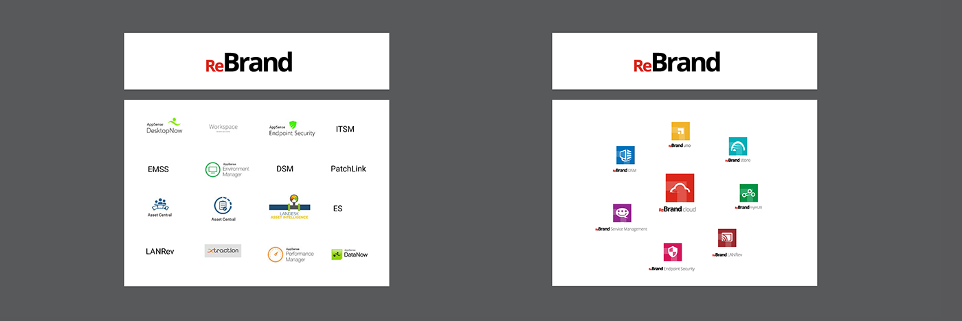
For my presentation, I put together a brand analysis of our current portfolio. I compiled all the product's branding for a side-by-side comparison, showing how each product's branding does not currently support the corporate brand. I also mocked-up some product icon design that was in line with the Adobe brand experience to present a more tangible representation of what our portfolio could be. I was soliciting feedback that would help me understand how the design system I was working on will impact the portfolio.
Brand impact
The second bit of information needed to move forward was better to understand the brand's impact on the product to support brand recognition. During the kickoff meeting, an example brought up as brand recognition within the product was Evernote. The argument was that Evernote leverages brand guidelines as their design system and the product for brand recognition.
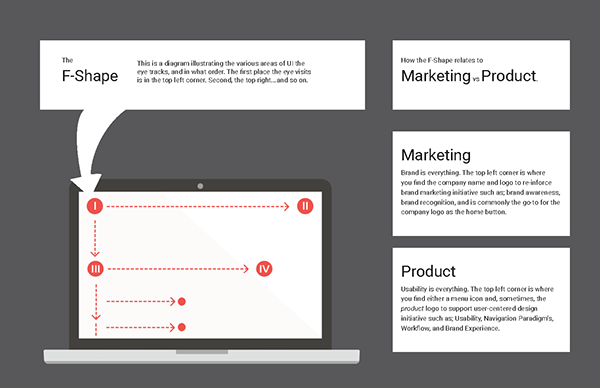
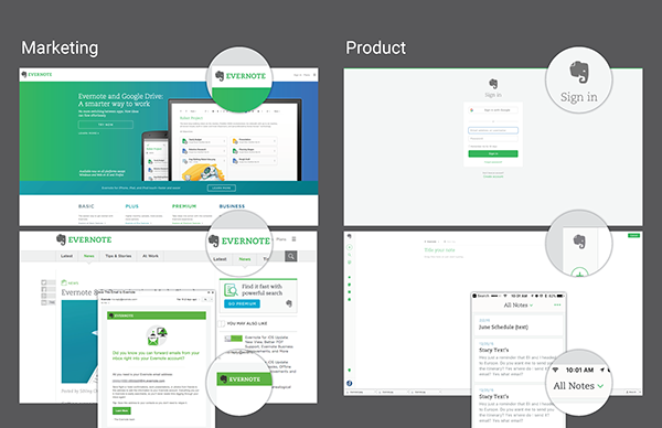
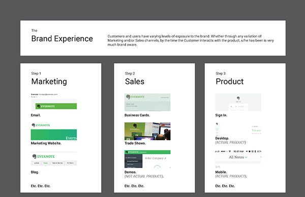
Evernote has a powerful example of what I am calling an End-to-End Brand Experience. The marketing website is saturated in the brand since it is the initial touchpoint to the product. Brand recognition should be high to resonate for a lasting impression. The login page reduces brand saturation, assuming the product to have been adopted and the brand has already left its impression. Within the product, the brand presence reduces significantly since the user experience becomes the primary focus. The most significant value screen real-estate can offer is to facilitate the user's goals within the product.
To demonstrate the varying levels of brand impact at particular touchpoints of the brand experience, I used an F-Shape diagram in conjunction with screenshots of Evernote's marketing tools, sales tools, and the product's UI. I then highlighted the number of opportunities for brand to impact our product. The presentation created a shared understanding of concepts that factor into gauging brand Impact to inform decisions moving forward with the design system supporting brand strategy.
New direction
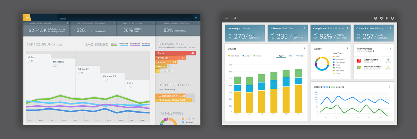
The feedback that resulted from this presentation was excellent. Yes, there was a strategic shift in what drives the product's design. Everyone aligned with recorded rationale as a data-point for measuring the success of the Participatory Design Strategy. We went from Trendsetter being what drove the design strategy to brand being the driver. Below are screenshots of the Trendsetter direction (left) and the new, brand driven design direction. We went from a rich, textured UI treatment to Flat Design. Brand and product aligned for implementing a cohesive, End-to-End Brand Experience.